
Ranking a single-page website comes with unique challenges. Unlike multi-page sites with content across different URLs for each keyword or audience segment, a single page has to do everything in one place.
It needs to tell your story, explain your offer, and convert visitors all within a single scroll.
That might sound limiting, but it’s far from impossible.
Many single-page sites rank well when every section is built with purpose and strategy.
This guide will show you how to make that happen.
What you will learn
- The pros and cons of relying on only one page for your entire site
- A 9-step SEO strategy built specifically for single-page websites
- Real examples of single-page sites that rank (and convert)
What are the pros and cons of single-page SEO?
Single-page SEO is the process of optimizing a single URL to rank on search engines and convert visitors, without relying on multiple blog posts, internal pages, or complex structures.
It’s especially useful for portfolios, product launches, SaaS tools, event pages, and app landing pages, where there’s one audience and one goal.
However, single-page websites do come with clear SEO tradeoffs.
On the one hand, they can load faster and provide a focused experience. On the other hand, they limit the number of keywords you can target and the amount of content you can rank.
Let’s unpack both sides:
Pros of single-page SEO
Compounding link equity
Every backlink you earn points to only one URL, meaning link authority isn't split across separate pages. This improves your search rankings if executed well.
Focused messaging
You get the chance to tell a clear and focused story. This makes having a single page a perfect fit for targeted audiences with a single intent, such as launching a product, building hype for an event, or getting sign-ups for a waitlist.
Better user experience
Rather than clicking to different web pages, users scroll and are more engaged. This matters even more on mobile devices, where tapping around can get clunky.
Faster site speed
With fewer assets to load, a single page typically delivers faster initial page load times. While page speed performance isn’t the strongest ranking factor, it still plays a role in Google’s Page Experience signals and can influence user engagement and bounce rates.
Easier to manage
There's no complex multi-page design. Updates, A/B tests, and edits are all made on the same page, which is ideal for lean teams or solo operators.
Cons of single-page SEO
Heavy reliance on external links
Because you don’t have multiple pages for internal linking, building domain authority depends more on getting backlinks from other websites.
Limited keyword coverage
It's almost impossible to target multiple keywords without cluttering your messaging or creating new pages.
Harder to rank for multiple topics
Unlike a multi-page website, you can't create different pages dedicated to services or FAQs.
This limits your ability to cover multiple topics without overwhelming the page’s content or sending mixed signals to search engines about your focus.
Challenging analytics segmentation
With all your traffic landing on a single page, tracking specific user behaviors through Google Analytics becomes more difficult.
You'll need to set up “event tracking” or “virtual pageviews” in Google Analytics to understand how users engage with sections.
Can limit long-term growth
Single-page sites can’t easily host blogs, case studies, or additional landing pages.
This hinders the ability to target new keywords over time or build topical authority, both critical for growth.
Single page websites work best when you have a narrow focus – one audience, one core set of keywords, one conversion goal. You give up breadth, but you gain focus and simplicity.
9 best practices for single-page SEO
Again, one-page sites can rank, but you have to be strategic. These nine best practices are drawn from what we’ve seen work in real-world projects.
I’ll walk you through the challenges they solve and the steps to fix them.
You’ll also see real-world examples and recommended tools including a few from Surfer’s toolkit along the way.
Step 1: Start with a clear and focused strategy
Your focus keyword should be tight, relevant, and built around an umbrella theme that directly aligns with your business goals.
Firstly:
Choose a primary keyword that speaks directly to your offer and ideal audience.
For example, a niche keyword like “women in UX” pulls around 140 monthly searches in the U.S., as shown right inside the search bar when you’ve got the Keyword Surfer Chrome extension running.
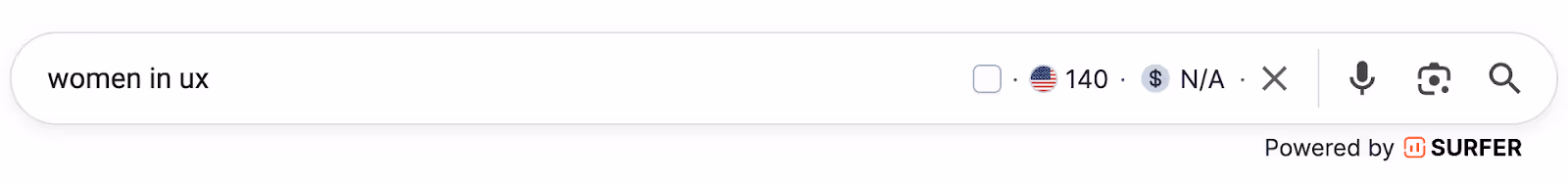
(Source: Google)
Now compare that to a broader term like “UX design,” which gets over 33,000 searches a month:
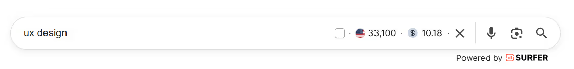
(Source: Google)
The difference in search volume is huge.
However, if you're selling a membership specifically for women in UX, the smaller niche keyword is far more likely to convert.
This is because it speaks directly to your target audience’s intent.
After choosing a niche keyword, use Google to validate it by looking for patterns:
- What content type does Google prioritize for that query?
- Are the top results blog posts, product pages, or community threads?
Then ask:
- Can your page match that intent — or do it even better?
Once you've chosen your primary keyword, map out 3–5 secondary keywords or long-tail variations. These could be related queries or specific questions your audience might search for.
One quick way to find them is right on Google: the “People also ask” and “People also search for” sections are packed with useful variations.
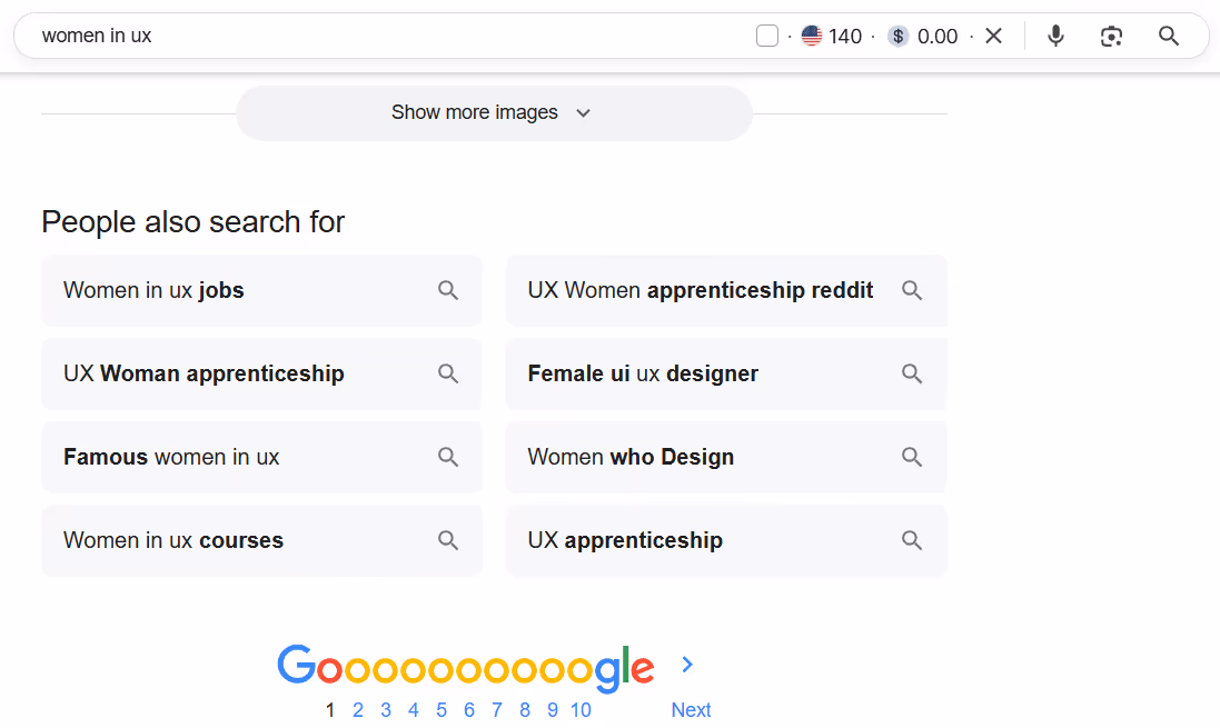
(Source: Google)
Then assign one relevant variation to a separate section of your page. This way, you support the main theme without diluting your keyword intent.
Take Floxies, for example.
The primary keyword — “Women in UX” — appears about three times across the page. Additionally, several supporting phrases show up in different sections to reinforce the main theme by adding context and broadening online visibility for related search queries.
These include:
- Women in UX/UI and Webflow
- Community for women in UX/UI and Webflow
- Women in the UX/UI and Webflow space
Every section of the entire page supports a clear goal: reaching and resonating with women in UX.

Avoid trying to cover unrelated topics, like throwing in “UI design trend” if you're focused on “UX career advice.” Same goes for keyword stuffing — it's tempting, but it makes your page look spammy and incoherent.
One page website = one primary keyword. You can’t (and shouldn’t) try to rank for everything at once.
Step 2: Structure the page with clear sections
Split the page’s content into logical and benefit-driven sections using H2 and H3 tags.
This is a key part of on-page SEO. Each section should answer the next logical question a visitor might have.
Search engines use your heading structure to:
- Understand your content hierarchy
- Segment topics
- Gauge relevance
When structuring, start with an H2 that solves a specific problem or promises a clear benefit. Then follow with 1–3 paragraphs that expand on it.
A few rules of thumb:
- Use relevant keywords in headings, but keep it natural
- Avoid keyword-stuffing or awkward phrasing
- Clarity > cleverness
Use sticky navigation menus or anchor links tied to each H2 to improve UX for mobile visitors. This helps users jump to what they need, and lets search bots crawl your page more efficiently.
Case in point: Norma.
Their benefit-led H2s and clean layout make the entire page easy to navigate for humans and bots. The sticky navigation bar features jump links for users to navigate to any section quickly.
Step 3: Create a title tag and meta description that convert
The title tag and meta description are how your page appears in search. They are your first impression on the search results page, and your best shot at earning a click.
When writing your title tag:
- Include your primary keyword
- Stay under 60 characters
- Lead with a hook or benefit that grabs attention
Once your title is set, write the meta description: the snippet that supports it and convinces users to click through.
When writing your meta description:
- Be specific about the value you're offering
- Use active voice to keep it sharp
- Include a clear call-to-action (like “Learn how it works” or “See examples in action”)
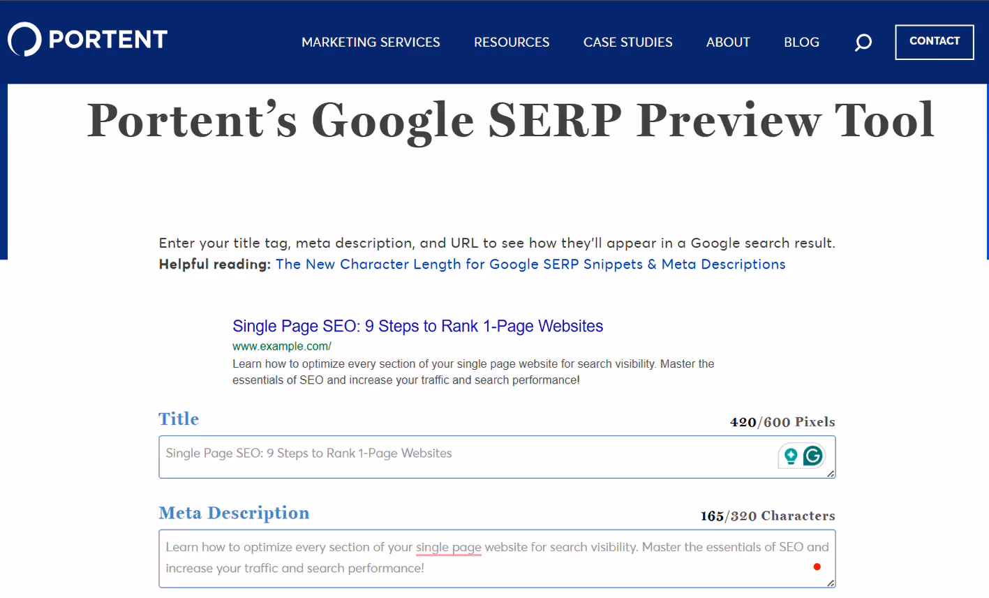
To preview how your title tag and meta description will appear on search engines, use Portent’s SERP Preview Tool.
It spots cut-off text and awkward phrasing before you hit publish.
For example, GP Communication gets this right with a clear, benefit-driven title and a straightforward meta description that sets accurate expectations from the start.
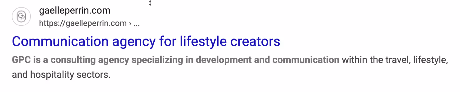
(Source: GP Communication)
While longer meta descriptions are technically allowed, search engines like Google often cut them off around 155–160 characters.
To play it safe, aim for this range or less.
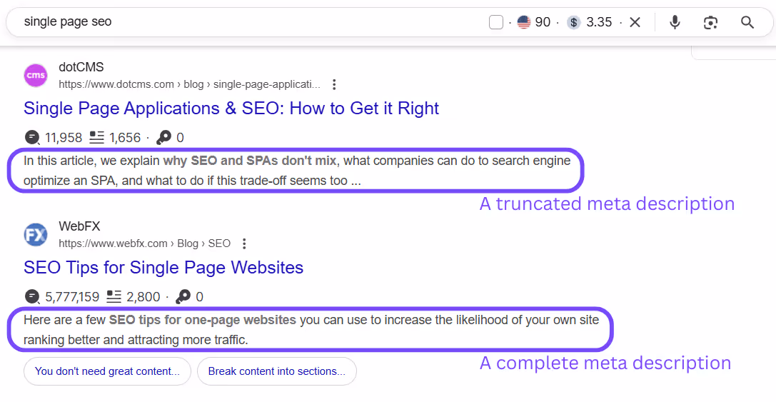
(Source: Google)
Step 4: Optimize for Core Web Vitals and fast load times
One slow load or an awkward shift on a page can cause users to leave.
When this happens repeatedly, it signals to Google that your page might not be meeting their search intent, and that can weaken your rankings.
Think of it like this:
Bad UX → users bounce → Google detects low engagement → rankings decline.
To measure and improve performance, Core Web Vitals give clear, user-focused benchmarks. These Google-backed metrics measure how users experience your page in real-time.
Here’s what each metric measures and how to optimize it:
1. LCP (Largest Contentful Paint)
What it measures: How fast the main content (like your headline or featured image) appears on screen.
Target: Under 2.5 seconds.
How to improve:
- Compress large images using tools like TinyPNG.
- Use next-gen formats like WebP or AVIF, which load faster than traditional formats like JPEG or PNG.
- Simplify what loads first. Focus on showing only essential content immediately, so the page feels faster to users.
- Consider using a lightweight hosting provider or CDN to cut down on server response time.
2. INP (Interaction to Next Paint)
What it measures: How quickly your site responds to any user input, like clicking a button or typing in a form.
Target: Keep delays consistently low.
How to improve:
- Reduce JavaScript bloat and third-party scripts. They slow down how fast the browser can react to user actions.
- Avoid heavy animations that tie up system resources and delay responses to user input.
- Optimize fonts and layout effects to prevent sluggishness during page interaction.
FID (First Input Delay) was the original metric for interactivity, but it has now been replaced by INP (Interaction to Next Paint) for a more complete picture of user experience.
According to Google’s Chrome team:
“...While both are responsiveness metrics, FID only measured the input delay of the first interaction on a page. INP improves on FID by observing all interactions on a page, beginning from the input delay, to the time it takes to run event handlers, and finally up until the browser has painted the next frame.”
3. CLS (Cumulative Layout Shift)
What it measures: Whether visual elements shift around while the page is loading.
Target: Keep layout shifts to a minimum.
How to improve:
- Set the width and height for all images and embeds.
- Always define image and video dimensions so the browser knows how much space to reserve while loading.
- Avoid injecting banners or popups mid-load, which can push content around.
- Use lazy loading for content further down the page, but make sure it doesn't cause layout jumps when it appears.
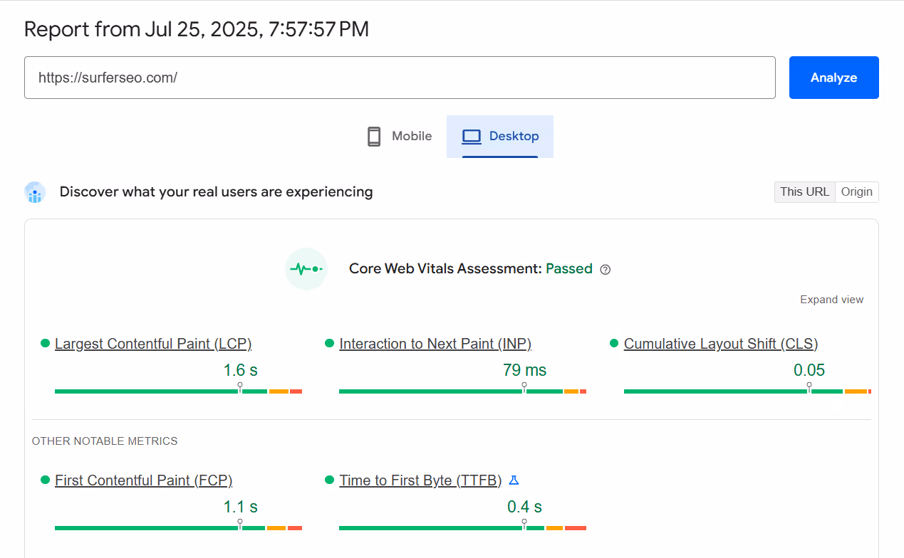
Once you’ve addressed these metrics, use tools like PageSpeed Insights and GTmetrix to test your site, spot what’s working, and uncover areas for improvement.
For example, we ran Surfer’s homepage through PageSpeed Insights to get a quick overview of its performance.
Speaking of tools, Surfer’s Audit tool flags when your page loads more slowly than competing pages ranking for the same keyword.
Another hint to optimize.

Step 5: Optimize readability for search engines and humans
If your content resembles a wall of text, users tend to bounce. When that happens, search engines notice.
Readability affects both user experience and SEO, so your page needs to be easy to scan, easy to understand, and easy to act on.
To make that happen:
- Keep paragraphs short. Aim for 2–4 lines max. Break up longer thoughts so they’re easier to read on any screen.
- Use bold text and bullet points to highlight key ideas. Most people are skimmers. Help them get the point as quickly as possible.
- Add a CTA button midway through, not just at the bottom. If it’s one long scroll, don’t assume everyone will make it to the footer.
- Include anchor links so users can jump to what they need. It improves navigation for users and helps search engines crawl your content better.
- Run your copy through Hemingway Editor to tighten up your sentences. It’s great for cutting fluff and making sure your writing lands clearly.
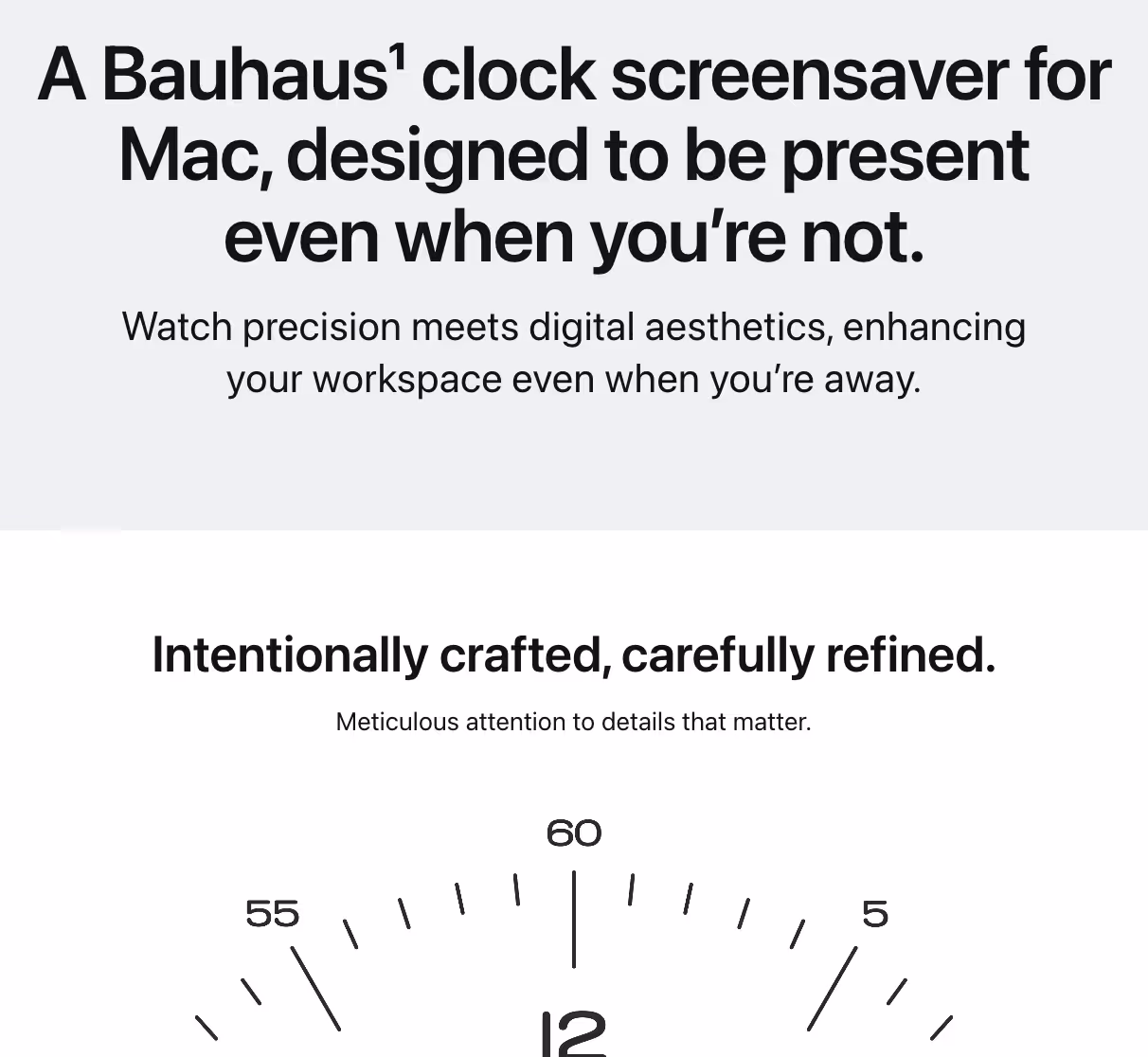
Bauhaus Clock pulls this off with clean, scalable formatting. The design is minimalist with lots of whitespace, and key phrases like “Your Mac deserves elegance” are isolated in headings for impact.
Additionally, the page has two CTAs: one in the sticky navigation menu and another at the end, so users can take action at any point while scrolling.
Step 6: Use schema markup to help Google understand the page
Single-page websites don’t give search engines much structure to work with. That’s where schema markup comes in handy.
Schema markup is a form of structured data you add to your site to help Google understand who you are, what the page is about, and what kind of content it contains.
For single-page sites, two schema types are especially useful:
- Organization schema: This includes your brand name, logo, and contact details so Google can connect your site to the rest of your online presence.
- Product or Review schema: Ideal if your page highlights specific products, features, or testimonials. It increases visibility in shopping and review-rich search results.
To keep it simple:
- Use Google’s Schema Markup Generator or Merkle’s free Schema Generator to create your JSON-LD code.
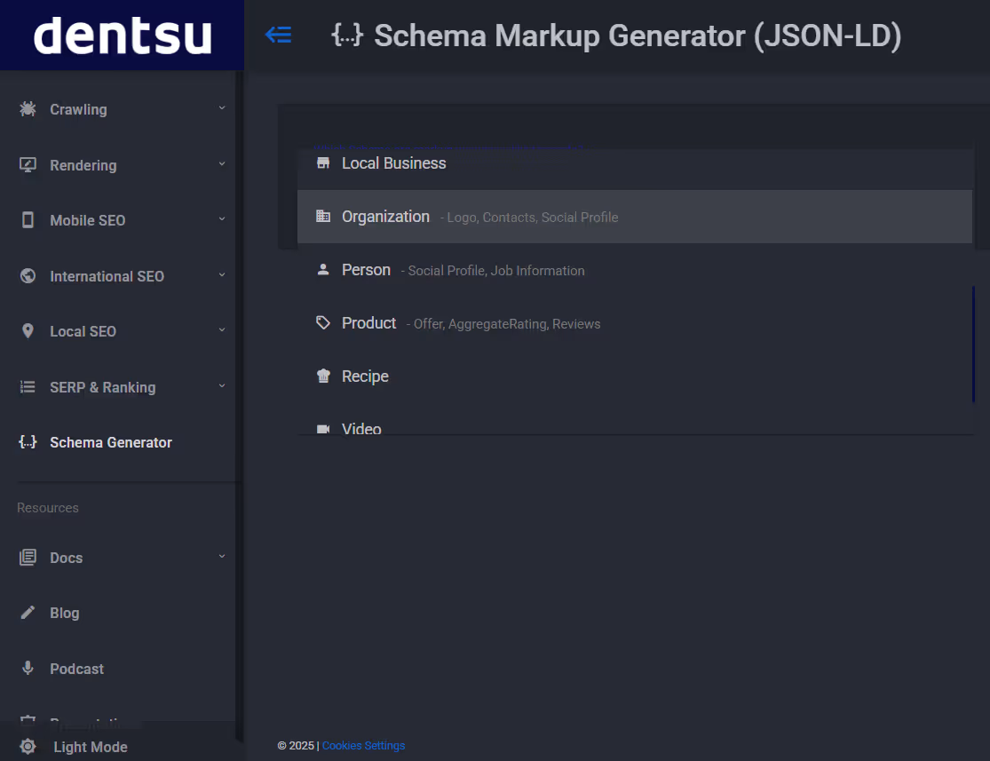
- Run it through Google’s Rich Results Test to catch any errors before going live.
Schema bridges the gap between what your page shows and what search engines need to interpret it correctly.
While it doesn’t boost rankings directly, using a Schema markup can help your page qualify for rich snippets (like review stars, pricing, or business info).
Step 7: Add visuals that support content and retain users
Visuals reinforce your message, create a more engaging layout, and keep users scrolling. However, they can slow your site and distract users from your core content when used poorly.
The rule is: every key message should be supported by a visual to add clarity or emphasis.
To make your visuals more effective:
- Place them near relevant content. Visuals should sit alongside or in related text blocks, not float randomly on the page.
- Use descriptive file names (e.g., ux-community-dashboard.png) to provide search engines with additional context.
- Add alt text that includes relevant keywords — this improves accessibility and helps with on-page SEO.
- Skip generic stock photos. Instead, use:
- Product mockups
- UI previews
- Charts, graphs, or data visualizations
- Annotated screenshots that explain features or results
As best practice, try to include at least one custom visual in each major content section. This keeps users visually engaged, improves scannability, and subtly increases time-on-page — all good signals for SEO.
Tools like Canva are great for creating quick visuals with minimal effort. If you're aiming for more flexible, high-fidelity UI/UX mockups, Figma is a better fit — even for beginners.
Case in point: Genesis. Visuals on the page are purposeful, informative, and aligned with the message at every scroll.
Step 8: Build backlinks
Backlinks are one of the strongest indicators of credibility on the web. When trusted sites link to your page, it signals credibility and increases your chances of ranking in search results.
Firstly, you need to start by giving people something worth linking to:
- A useful tool or interactive demo
- A visually impressive portfolio
- A curated resource list
- A strong, opinionated piece with a unique take
Once you’ve got something solid, share it.
At this step, you pitch your page to sites that already serve your audience:
- Relevant blogs, directories, or newsletters
- Design showcases or product roundups
- Communities like r/web_design, r/SideProject, or r/InternetIsBeautiful
Keep your outreach personal, short, and valuable. Help them see why your page is a good fit for their readers.
For example:
Hey Alexis, we recently launched a minimalist, browser-based UX onboarding walkthrough tool designed to help teams improve product tours without heavy setup. I noticed your newsletter/blog features thoughtful, design-focused picks, and thought this might be a good fit. Would love for you to take a look and see if it’s worth sharing with your audience.
Other places to pitch:
- SaaS tools: Startup Resources, FutureTools.io
- Design portfolios: One Page Love, Bestfolios
- Landing page templates: Land-Book
- Launch platforms: Product Hunt, BetaList
You can also build backlinks through digital PR by getting featured in tool roundups, curated lists, or startup spotlights in your niche.
Step 9: Encourage action with conversion-optimized CTAs
Since there’s no extra page to nudge the user later, your CTA has to work harder than usual.
The first step is closing with a clear, benefit-driven summary — what’s the one thing the visitor gains by taking action? Say it plainly. Then lead them directly to the next step.
For your CTA to land, nail these basics:
- A bold, visually prominent CTA button — like “Get Early Access”, “Contact Us”, or “Buy Now”.
- A one-line value statement just above the CTA button to reinforce the payoff. For example, “Join 3,000+ designers improving their UX workflow today.”
- Include trust-builders near the CTA — testimonials, trust badges, user counts, or press logos.
- A “Back to Top” anchor or floating icon for smooth navigation, especially on longer, scroll-heavy sites.
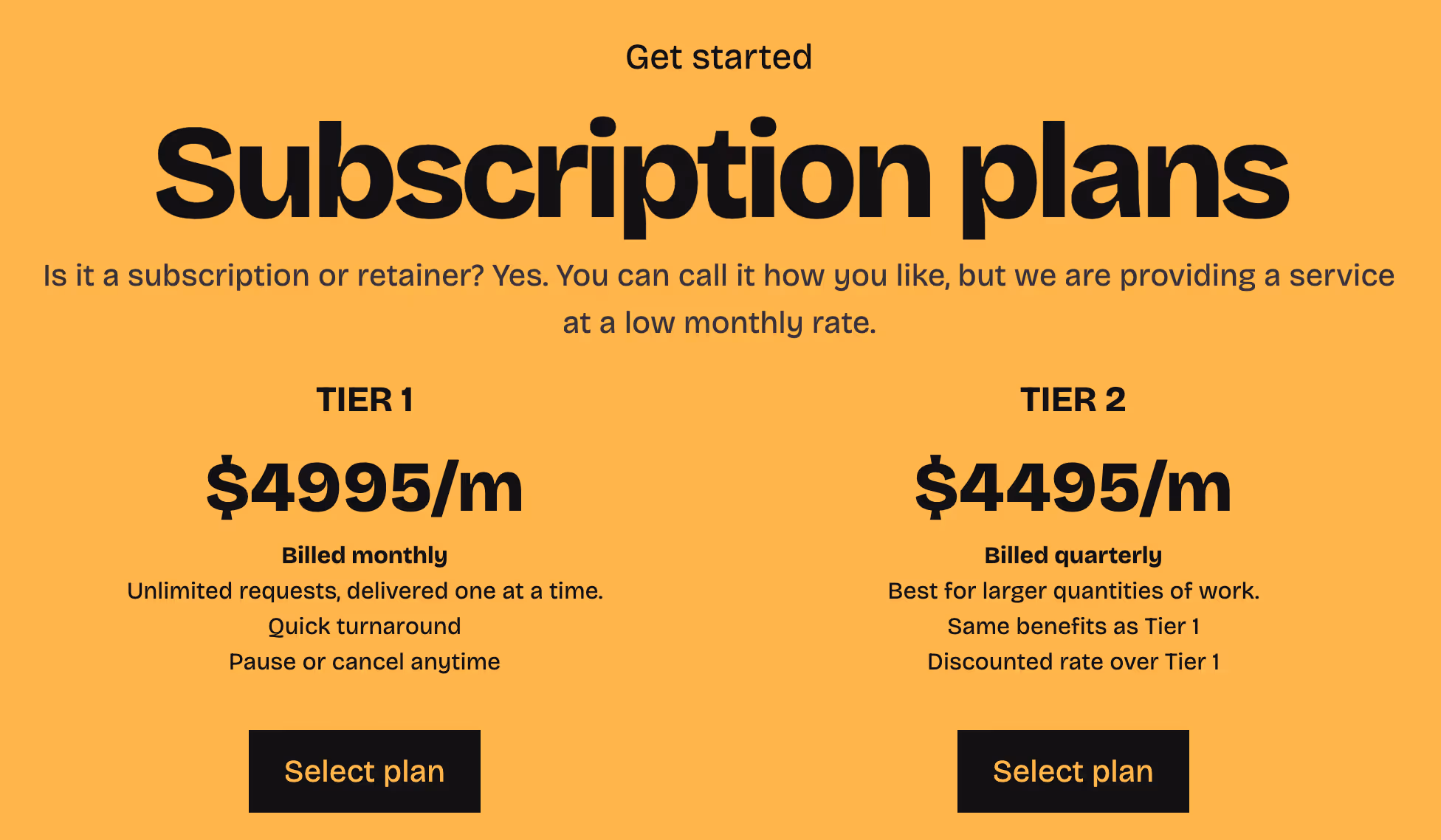
Good Company Design nails this with visually prominent CTAs surrounded by subtle credibility cues.
These include which tier is best for whom and being able to pause or cancel anytime to reassure users right at the moment of decision.
Key takeaways
- Single-page SEO focuses on optimizing one URL to rank well and drive action. Because you only have one shot, it calls for a sharper, more intentional strategy than multi-page sites.
- It works best for use cases with a focused goal, like portfolios, product launches, SaaS tools, or event pages.
- The main advantages are faster load speeds, better UX for mobile users, consolidated link equity, and easier maintenance.
- The trade-offs? Limited keyword coverage, no internal linking, and greater dependence on backlinks to build authority.
- To succeed, you’ll need to nail the essentials: smart target keywords, clear page structure, well-written title tags and meta descriptions, compelling visuals, and a well-placed CTA.
- For better performance, focus on improving Core Web Vitals (LCP, INP, CLS) through media compression, lazy loading, and minimal JavaScript.
- Add relevant schema markup (like Organization, Product, or Review), and double-check it using Google’s Rich Results Test to ensure you’re eligible for rich snippets.
- Finally, build credibility and drive traffic by earning quality backlinks, and close with a conversion-focused CTA.


![SaaS SEO In 10 Steps [Examples included]](https://marketing-assets.surferseo.art/wf-cdn/62666115cfab453aacbd513c/65f0156b2090c8984bed2f4a_blog-authors-15.avif)


