Mobile SEO is important in modern digital marketing strategies due to the growing volume of searches conducted on mobile devices compared to desktops.
With mobile traffic accounting for a significant portion of web visits, ensuring your site is mobile-friendly can dramatically impact your visibility and user experience.
A proactive mobile SEO strategy is essential to optimize for mobile users and leverage the increasing mobile search trends.
This guide will walk you through the fundamentals of mobile search engine optimization (SEO), offering practical tips and best practices to help your website perform optimally on mobile devices.
Let’s get started.
What you will learn
- What mobile SEO is and why it’s important
- How to set up your website for mobile visitors
- Mobile SEO best practices
- How to monitor your site’s mobile performance
What is mobile SEO?
Mobile SEO is the practice of optimizing a website to ensure it performs well on mobile devices, such as smartphones and tablets.
In many ways, mobile optimization is similar to traditional search engine optimization, but mobile SEO requires a few additional things to ensure the needs of visitors on mobile are met.
As smartphones and tablets continue to claim a larger share of the search market, mobile SEO is essential for any webmaster seeking to increase their visibility and web traffic.
Why mobile SEO matters?
Mobile SEO matters because a well-optimized mobile site is crucial for ensuring visibility in search results, user experience, and conversion rates.
Mobile devices account for a significant and growing portion of web traffic, making it essential to optimize for mobile to improve visibility, user experience, and search engine rankings.
Mobile traffic is more popular than desktop
In 2024, mobile traffic accounted for 60.67% of all web traffic.
While mobile has taken the forefront in general web traffic, it has been even more impactful in search. By 2021, 63% of all search engine visits came from mobile devices, with trends indicating an even larger share in the future.
This means mobile search optimization can unlock terrific opportunities to improve visibility in search engine results pages and increase organic traffic.
Google uses a mobile first index
Recognizing the trend, Google started focusing on mobile pages in 2015, and in late 2023 completed the switch to mobile-first indexing.
This means that even when you use a desktop computer, the search engine uses the mobile version of the page to determine search rankings.
This is not to say it will not index desktop versions of sites; it will still deliver desktop page versions to desktop users. But when calculating how well a site answers a search query, it places great importance on the mobile version of the site.
Customers prefer to shop from mobile devices
Mobile devices are now playing an increasingly important role in e-commerce as well.
In a 2017 study, Google found a steady increase in sales-oriented searches from mobile device users.
Other key statistics from this report included:
- Mobile searches using buying phrases like “best,” “on sale” or “near me” grew by more than 250% in just two years.
- Mobile searches for product reviews increased by 35% over the same period.
More importantly, Google also found 40% of people preferred using the mobile version of websites for the entire buying journey, from research to actually purchasing.
How to configure your website for mobile devices
Now that you understand the importance of optimizing mobile pages, it’s time to discuss how to generate a positive mobile experience for your users on smartphones and tablets.
Responsive design
There are a few different approaches you can use, but most SEO professionals would agree that a responsive site is the best way to create a smartphone- and tablet-friendly website.
Responsive web design means your webpages adapt to the user’s device.
You only have one version of your site, and it sends the same HTML code to every user, regardless of device. However, CSS is used to change how the page is rendered.
In other words, search engines deliver mobile content to mobile searchers, while desktop users get the desktop version.
This is seen as the best approach for SEO for several reasons, including because it allows you to use a single URL for each page, rather than having a separate version for mobile.
It is also easier to maintain than other mobile approaches. Whereas with other approaches, you may need to update multiple pages to make minor code changes or modifications, with a responsive design, you only need to update a single URL to make changes across devices.
Responsive websites also tend to load more quickly on all platforms; eliminating redirects, adaptable images, and other things that can lengthen your loading time.
This is particularly important for online retailers, as a loading delay of a single second can impact conversions by as much as 20%.
It also directly impacts how Google and other search engines crawl your site. Rather than exhausting your crawl budget on multiple versions of a page, responsive design saves resources by allowing search bots to crawl a single page.
Dynamic serving
Another approach is to serve each page dynamically. This means visitors are shown a page with a different code, depending on the device they’re using.
The URL remains the same, but the content is different.
While not the worst option for mobile-friendly website configuration, this approach is inferior to responsive design for a few reasons.
For one thing, sites using dynamic serving have an unfortunate tendency to show desktop sites to mobile users and vice versa.
This leads to frustration and bad user experiences.
Dynamic serving is also more labor-intensive to maintain, as you’ll need to create different page versions for new devices.
Separate URLs
The least preffered option is to use different URLs for your desktop and mobile sites, usually using an M configuration, such as en.wikipedia.org/wiki/GameCube vs. en.m.wikipedia.org/wiki/GameCube.
Google does not recommend using this approach because using a separate mobile URL is more difficult to manage, requires the use of canonical tags, and increases the risk of pages being labeled as duplicate content.
It also makes it easier for users to share the wrong version of a page.
9 Mobile SEO best practices to follow
Now that we’ve discussed the importance of mobile SEO and the various approaches to it, it’s time to look at some of the best practices for ensuring your site ranks as highly as possible for mobile search.
Here are 9 best practices:
1. Optimize site speed
Desktop site speed load time is important for SEO and good user experiences. For mobile users, it's absolutely vital.
A Google study found that as page load time went from one to three seconds, the bounce probability for mobile visitors increased by 32%. By five seconds it reaches 90% and by 10 seconds, a whopping 123%.
If you haven’t already, you should use Google’s PageSpeed Insights to assess how quickly your website loads.

The PageSpeed Insights report will also show you areas for improvement.
Mobile page speed is something many websites struggle with, but luckily there are a number of things you can do if your site is loading too slowly, including:
- Compressing and optimizing images
- Eliminating or reducing redirects
- Enabling browser caching
- Minifying CSS, JavaScript and HTML code
- Using a content delivery network (CDN)
2. Properly format content
For mobile devices, it's important to create mobile-friendly content. Because screens on smartphones and tablets are generally smaller than those on laptops or desktop computers, you need to create mobile content that is easy for a mobile user to consume.
Here are some tips for optimizing text content on a mobile website:
- Use short, scannable blocks of text: Instead of long paragraphs, break content into brief, easily digestible sections.
- Limit paragraphs to 1-2 sentences: Ensure each paragraph fits within the mobile screen without requiring scrolling.
- Keep headlines and subheads concise: Aim for short, direct headlines and subheads that are easy to read at a glance.
- Maintain line length between 50-60 characters: This ensures text is easy to read on small screens.
- Choose readable fonts: Avoid small or hard-to-read fonts. Use at least a 14px font size with legible fonts like Arial, Futura, Georgia, or Montserrat.
- Provide ample white space: Ensure enough space around the text to enhance readability and reduce clutter.
- Ensure high contrast between text and background: This is especially important for readability in direct sunlight.
- Avoid intrusive pop-ups: Steer clear of using interstitials that interrupt the user experience, as Google may penalize sites that misuse them.
3. Optimize images
Essential for content consumption, images are vital assets for nearly every website. To keep your visitors happy and on your site, make sure you’re optimizing all your visual assets for users with smaller screens.
You need to be aware of screen resolutions and use smaller images for mobile users. This will save you storage space and help expedite loading times.
Generally speaking, most webmasters will want images that meet the following specifications:
- Hero images – 800x1200 pixels
- Banner images – 320x480, 300x250 or 320x 50 pixels
- Body images – 640x320 pixels
If your images are too large, consider resizing or even removing them, if they are not necessary.
You should also choose image file formats that load quickly. PNGs are best for larger images like logos, images with text, or highly detailed images with a transparent background.
JPGs are better suited to photos and colorful images. They’re smaller in size than PNG files, but are not lossless when compressed.
WebP files offer the smallest format without compromising quality on mobile sites, making them particularly advantageous for mobile sites
4. Optimize tap targets
Tap targets are the parts of a webpage that users can touch to interact with them. This includes elements like navigation links, form fields and buttons.

As the primary way in which mobile users will be using your site, these must be easy and intuitive to use, particularly on e-commerce sites.
To optimize them for smartphone users, your tap targets should be at least 48x48 pixels, or the size of a person’s finger pad.
If your icons or other tap targets are less than the recommended size, you should use additional padding to bring them up to size.
Make sure that other page elements are not blocking or overlapping your tap targets to provide the best user experience.
5. Optimize for voice search
Voice search is a rapidly growing part of SEO.
27% of all smartphone users regularly perform voice searches.
This number is even higher in younger demographics, with 65% of people admitting to using voice-enabled devices often.
Thanks to programs like Siri and Alexa, this number continues to rise, as people otherwise occupied with driving or another task that requires their hands and eyes, can now search for answers online.
To claim your share of these searches, you should optimize your site for semantic search.
Semantic search helps you leverage conversational queries to boost your visibility.
Instead of searching for “Adidas Sambas,” a voice searcher is more likely to ask a natural question like “where can I buy Adidas Sambas near me?”
To capitalize on these queries, your copy should be natural and conversational.
Use questions as subheads, and then answer these questions with short, correct, and relevant copy.
A good approach is to use long-tail keywords to match what your targets are searching for.
These can be used in headers, throughout the copy, or in FAQ pages.
You can find long-tail keywords in several ways.
From within Google, you can use autocomplete, People Also Ask boxes, and People Also Search For to find ideas.

When choosing which keywords to target, you should also check their popularity and competitiveness.
For that, you can use a keyword research tool.
Using Surfer's Topic Explorer, you can discover countless topics and keywords that people use related to your main topic.

6. Use schema markup
Schema is the commonly accepted standard for structured data across the Internet. It organizes data in a way that is easy for Google and other search engines to understand.
Using this data, Google returns rich snippets, which are results with extra data displayed.
This includes things like carousels, recipes, star reviews, and other non-textual elements in search engine results pages.
Because SERPs on mobile have less real estate than their desktop counterparts, rich results stand out even more.

As such, they’re more likely to encourage clicks and garner more traffic than pages that do not employ structured data.
If you’re not intimately familiar with schema markup, Google’s Structured Data Markup Helper makes adding it to your site much easier.

7. Keep metadata short
Metadata like title tags and meta descriptions are an important part of SEO.
They give search engine spiders information about the website’s content. They also provide searchers with a snapshot of what to expect.
With the limited space mobile search provides, it’s important to keep this information short and to the point.
Meta descriptions should be engaging and informative to encourage clicks while avoiding SERP truncation.
Most experts agree meta titles should be between 50-70 characters, with descriptions of 160 characters or less.
Good metadata will provide unique descriptions for each page and relevant information about its content. It should inspire curiosity or action from searchers, which will encourage organic clicks.

8. Use the viewport meta tag
Viewport controls the width of a webpage based on the user’s device. If properly configured, it will eliminate the need for pinching, zooming, and side-scrolling for mobile users.
If you do not include viewport metadata on your website, it will render at a fallback width that is typically the width of a desktop screen.
This leads to frustration and poor user experiences from mobile users.
Luckily, configuring a viewport is easy. Simply add the following HTML snippet to your site’s header file:

9. Use a secure protocol
Google places significant value on website security, prioritizing the more secure HTTPS protocol over HTTP pages. Additionally, many users won’t visit sites that are labeled as non-secure.
If you want to maximize traffic and search rankings, it’s important to keep your pages secure and optimized for mobile devices.
This starts with an SSL, or secure socket layer.
SSL is an extra layer of encryption between the server and browser, which turns HTTP into HTTPS.
It ensures privacy, authentication, and data integrity on both desktops and mobile devices.
To ensure the security of your site and identify issues or potential issues, you can use a Website Security Checker.
Input your URL into the search box, and with a few clicks, it will identify any security concerns.
How to check your site’s mobile-friendliness
You can check your site's mobile friendliness using Google's Mobile-Friendly Test tool or by reviewing mobile performance metrics in Google Search Console.
Start with Google Search Console (GSC) > Core Web Vitals > Mobile.
Clicking on this will give you a list of any and all mobile issues your site currently has.

This could include things like content that is too wide for mobile screens, clickable elements that are too close together and text that is too small for optimal mobile viewing.
Another useful tool from the search engine giant is Google Lighthouse. An open-source tool for evaluating the quality of web pages, it includes mobile-friendly testing.
To check your pages’ mobile scores, download Chrome DevTools and navigate to the page you want to test. Right-click on the page, select “Inspect” from the toolbar, and then click on “Lighthouse.”
You will be presented with a list of categories, taking care to select “mobile” for a mobile report. After pressing “Generate report,” you’ll receive a report featuring scores for each category.
A good score will be between 50 and 89, with anything scoring 90 or above being considered excellent.
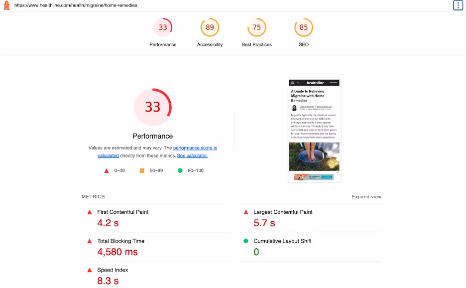
If you do score 49 or below in any category, you’ll want to dive deeper to discover what’s causing the issue.
It’s also a good idea to use Google Analytics to assess your mobile traffic, both before and after your SEO efforts.
Take note of the amount of organic mobile traffic your site is generating before you start your mobile optimization.
Then compare this with your numbers after it has been running for a few weeks to see how successful you have been.
Key Takeaways
- Mobile search has surpassed desktop search and continues to grow.
- A large percentage of customers prefer to use mobile devices for the entire shopping process.
- Many of the elements of traditional desktop SEO are important for mobile SEO, with some, like loading speed, being even more important for smartphone users.
- Content and images need to be formatted in a mobile-friendly manner to create positive user experiences and avoid frustration.
- Thanks to mobile devices and virtual assistants, voice search continues to grow in importance.
- For mobile users, metadata must be short and powerful.
- Security remains paramount for mobile users.
Conclusion
Mobile devices like smartphones and tablets have dramatically reshaped the way the average person interacts with the internet.
Accounting for 63% of all search engine visits, mobile devices are claiming an ever-growing percentage of internet traffic, which makes mobile SEO all the more important.
By employing the best practices listed here and keeping an eye on your site, you can ensure you’re well-positioned to claim organic traffic from mobile users.
mobile users.