Oddball's research shows that 47.8% of traffic comes from organic search, with another 8.8% coming from organic social channels. This means you can attract plenty of visitors without burning through your budget—but you must get creative with promotion.
Effective promotion strategies drive visibility, organic traffic, and search rankings by ensuring your site and brand stay front of mind for your audience. In this guide, you'll learn how to make this happen through free, effective techniques.
What you will learn
- How to promote a website using traditional and unconventional promotion methods
- Which promotional techniques best attract links and organic engagement
1. Perform SEO best practices
Search engine optimization (SEO) is the best long-term investment you can make in your site's visibility and organic traffic—and it can be done on a budget.
For example, you can find keywords to target without spending a dollar by simply looking at the search results. Start typing the main keyword, and see what Google Autocomplete suggests, like so:

To expand your search and come up with keyword/topic ideas, you can look at the People Also Ask section:

These long-tail queries are particularly valuable because answering them helps optimize your content for Google's AI Overviews and AI chatbots, which are becoming an increasingly important source of organic traffic.
When exploring keyword ideas, pay special attention to search intent. Each keyword falls into one of four intent categories:
- Informational ("What is X," "How to do X"...)
- Navigational ("Nike website," "Pinterest login"...)
- Commercial ("Best X of 2025", "X vs. Y comparison"...)
- Transactional ("Buy X online," "X discount coupon"...)
You need to match your content's format and angle to the keyword's search intent to show Google that it can help the user achieve their goal quickly and accurately.
For example, informational keywords typically call for explanatory articles or how-to guides, while commercial intent requires product reviews or comparisons.
After uncovering keywords, make sure to use them in these places:
- Metadata: Your page's meta title and description will appear in search results, so they must accurately describe the page and contain the main keyword.
- URL: Including the keyword in the URL helps Google's crawlers index the page more easily and connect it to the corresponding query.

- Headings: The main heading (H1) should include the main keyword, while other headings (H2, H3, etc.) should contain variations.
- Body content: Try to include the keyword throughout the text (especially in the intro), but make sure to do it naturally to avoid keyword stuffing.
Finally, use internal links strategically to connect your content to related clusters. Each cluster should contain:
- A pillar page, which typically contains long-form content that covers a topic on a high level
- Supporting pages, which elaborate on the specific points brushed over in the pillar page
Topic clusters show search engines that your site covers a given subject thoroughly enough to offer all the information a user needs (which is called topical authority). As a result, you're more likely to rank higher than competitors without such extensive topic coverage.
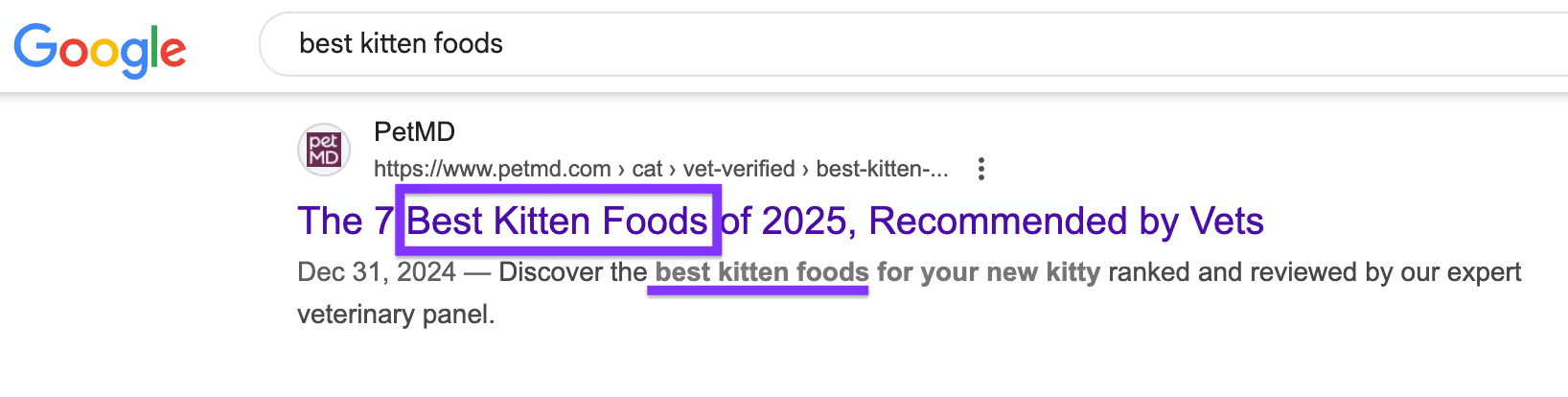
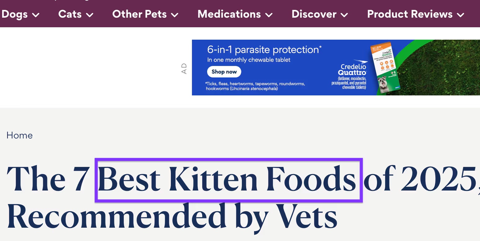
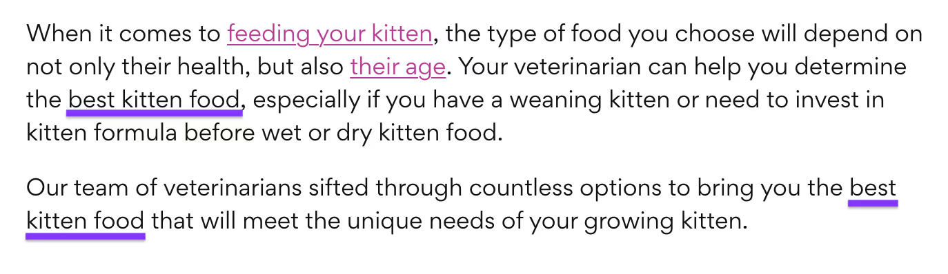
If you need an example of a website that nails its SEO strategy, look at Investopedia. It checks all the necessary on-page SEO boxes, most notably:
- A robust library of quality content
- Strategic internal linking
- Comprehensive keyword coverage and strategic placement
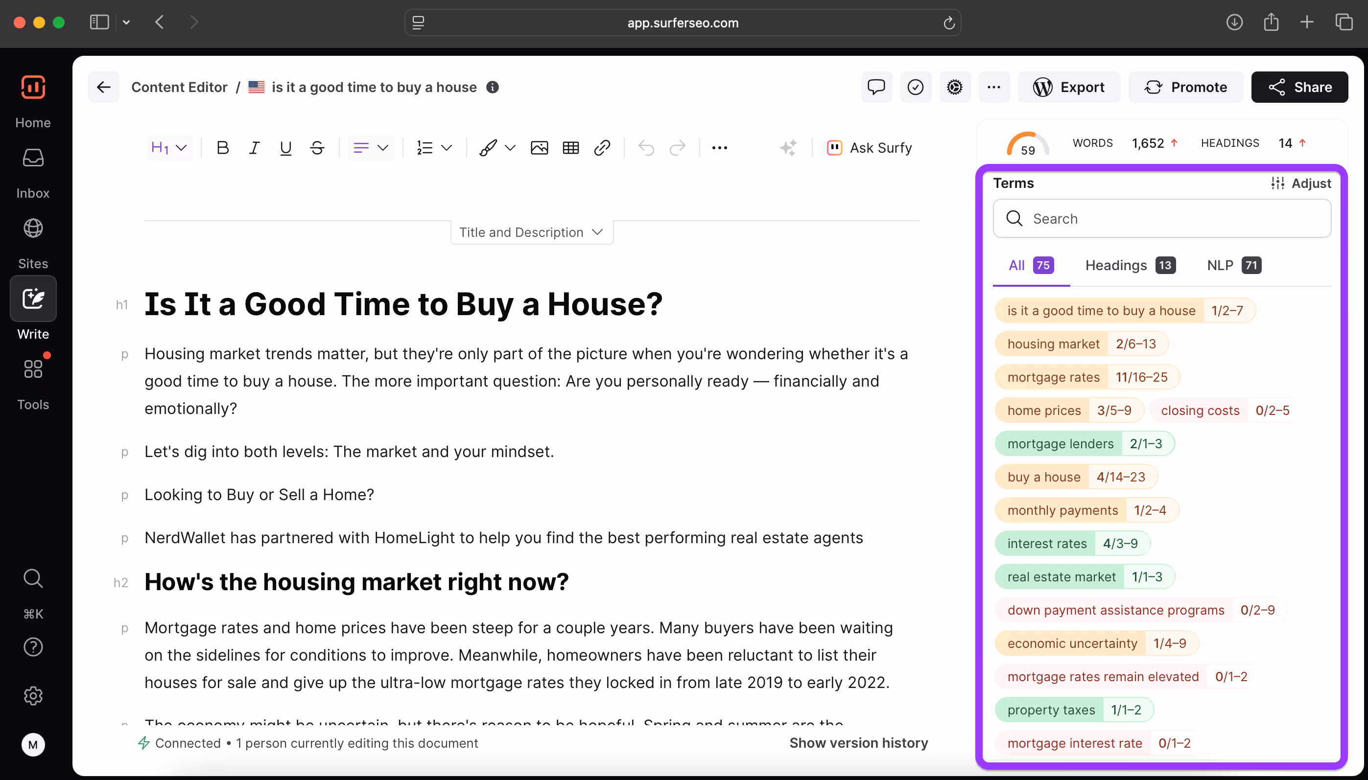
Surfer was built to help implement SEO best practices without you having to become an SEO expert. You can find content ideas to write about, which keywords to include on your page, and track competitors.
2. Build a personal brand through opinions and experiences
Personal thought leadership is an effective way to increase website traffic and establish yourself as a reputable source in your niche. By consistently posting thought-provoking, engaging content, you can build brand awareness and trust with your audience.
This trust translates into frequent visitors and even free promotion through backlinks. If other websites see you as authoritative, they'll link to your content and funnel their visitors to it, which can do wonders for your traffic.
To enjoy these benefits, follow these tips when creating content:
- Publish opinion pieces to get your ideas noticed and engage your audience
- Discuss personal experiences and offer unique perspectives on the topics your target audience cares about
- Find and maintain a consistent brand voice that keeps you connected to readers
A major benefit of building a personal brand is that once your audience knows about you, you no longer have to rely on search engines for consistent traffic. Users will come looking for you through branded searches because they'll want your insights specifically.
You can leverage such searches by including your name throughout the website, most notably in places like the domain name, author bio, or the About page. Doing so will help you rank for branded searches and make it easier for users to find you.
To expand your reach and brand mentions beyond Google, share your content on platforms like:
- X/Twitter
- Substack
A perfect example of a strong personal brand is Tomasz Tunguz, a venture capitalist well-known in the SaaS and AI circles. He consistently publishes valuable content across channels, which has earned him a stellar reputation.
Besides a solid organic presence in search engines, Tunguz has a massive mailing list of over 150k subscribers. You should consider building your list as you get your name out there, as doing so lets you leverage email marketing to draw in more traffic.
3. Create reports and original research
Speaking of authority, data-driven content is a surefire way to achieve it. Proprietary research, first-hand data, and industry trend overviews can be a goldmine for backlinks and drive traffic to your website with little to no effort on your part.
Besides other sites in your niche, original studies are often referenced by generalist bloggers and journalists, which can give your brand tons of free exposure.
As long as your piece offers accurate, credible, and relevant data, you can passively build backlinks in the long run.
Examples of content pieces that make this happen include:
- Industry trend reports
- Benchmarking guides
- User behavior studies
- Large-scale surveys
Data-driven content might require some time and effort, but it's more than worth it if you want to promote your website without hefty investments.
While you can post your pieces as typical articles, you'll want to go a step further and turn them into visually appealing charts and downloadable PDFs. These formats boost shareability and can be used as embeds or infographics instead of plain text links.
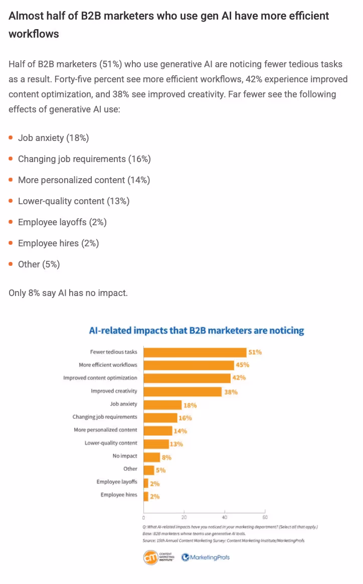
If you need a reference point for high-quality content that draws plenty of backlinks, look at Content Marketing Institute's annual B2B reports. They discuss benchmarks and trends for the current or upcoming year, offering plenty of value to marketers.
As a result, over 1,200 websites have linked to the reports, which have gathered over 3,500 links in total.
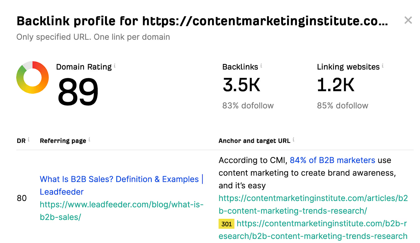
As a bonus, Content Marketing Institute made a wise move by not changing the URL as updated reports are published. This means that the page's backlinks keep compounding year after year, further strengthening its authority.
4. Partner with a complementary business for a podcast or newsletter
Tapping into someone else's audience can help expand yours quickly—but you must choose that someone carefully. Partner with businesses whose audiences overlap with yours while making sure there's no direct competition.
For example, if you offer graphic design services, you can partner with a branding company to expand the reach of both businesses.
While some business owners charge for partnerships, many partners will be happy to collaborate without any direct incentives. After all, doing so can bring new traffic to both websites, so everyone wins.
You can collaborate on all sorts of projects and promotion strategies, such as:
- Podcast interviews
- Joint newsletters
- Webinars
- Giveaways (which are especially popular on social media platforms)
Ideally, the collaboration will involve multi-channel distribution to maximize visibility across platforms, and this distribution should be shared between partners.
Social media is an easy way to find potential partners, but you can also use lead tools that will include a phone number lookup to connect with those that may not have social media presence.
For example, you can post shared content on your YouTube channel, while your collaborator can post Instagram Reels or TikToks.
Besides increased traffic to your website, collaborations help you form fruitful partnerships you'll need to get your name out there. They help with backlinking and social mentions, and you can unlock new partnership opportunities as your network expands.
A great example of a personal brand that leverages partnerships is David Perell, a writing coach and podcaster.

He regularly invites prominent guests to his podcast, including AI experts, famous writers, and other well-known figures in related niches.
The interviews consistently give Perell fresh and authoritative content to publish. In return, his guests can significantly expand their audiences and further solidify their brands.
5. Build free, useful tools for your audience
Freebies can boost your traffic and backlinks, but you should go beyond whitepapers and reports to create something users keep coming back to. Go the extra mile by building free online tools related to your business, such as:
- Price calculators
- Audit checkers
- Savings estimators
Besides making your site more interactive and engaging, such tools are often featured in round-ups and listicles (like LenderKit's article on investment calculators).
As your tools get picked up by other sites, you get free promotion and authoritative links, which bring traffic to your website and boost your authority.
Besides featuring the tools on dedicated pages, you can make them embeddable to increase external shares. This might require some coding skills, but it shouldn't be too challenging for simple tools.
To see free tools in action, you can check out Legal Templates. They offer plenty of contract templates you can download in PDF or Word without signing up or leaving your email, which provides plenty of value for free.
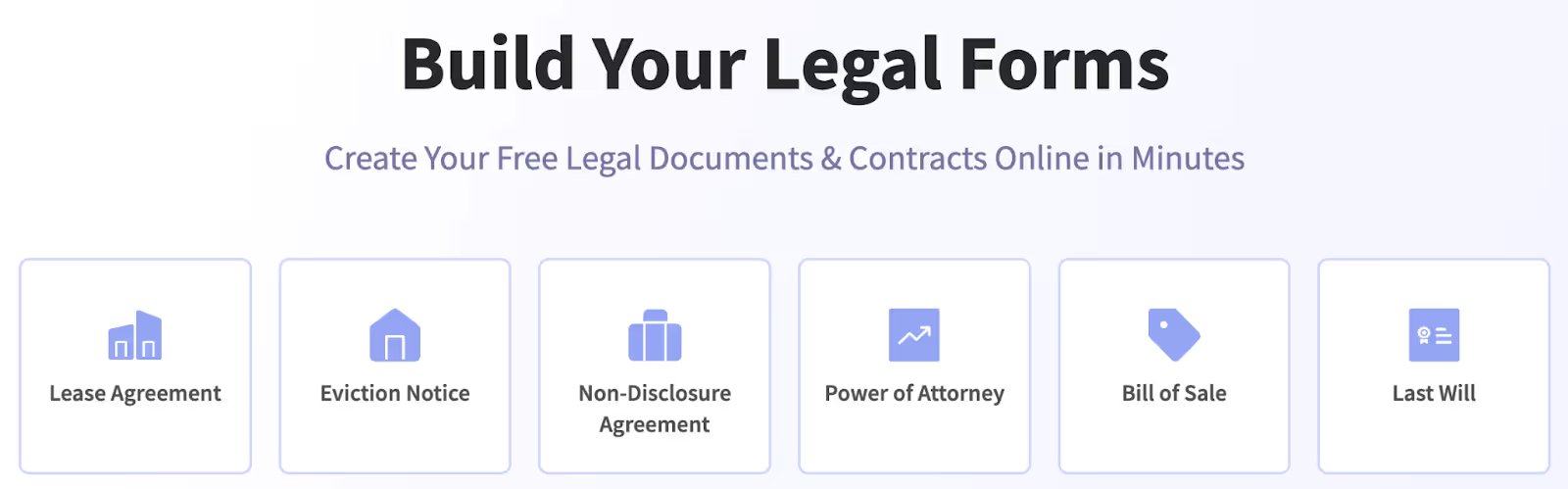
This results in a whopping 57,000+ backlinks from across the web, many of which come from reputable legal and small business blogs.
6. Use social media
Social media marketing is the cornerstone of free website promotion. Until you have the budget for paid ads and sponsored posts, you can repurpose existing content for Twitter/X, Instagram, and LinkedIn to drive recurring traffic to your website.
Unlike your website content, which mainly revolves around blog posts, social media content should be short and catchy. This includes:
- Short-form videos (e.g., Reels or TikToks)
- Linkedin carousels
- Engaging threads
Besides business-related and evergreen content, use different social media platforms to cover trending topics in your industry. Many platforms have dedicated Trending tabs you can explore, though you can also use tools like Google Trends to find emerging topics.
When posting content on social media, ensure brand consistency and leverage your personal brand to create content that resonates with your audience and makes you relatable. Your social persona can make a world of difference to engagement, so make sure to stand out through unique perspectives instead of posting generic content.
Another effective way to grab users' attention is to post behind-the-scenes content. Doing so adds a personal touch and gives your audience a peek behind the curtain, which will make them feel more connected to you.
Finally, social media is perfect for publishing short teasers that will drive traffic to the original content. For example, you can publish excerpts from blog posts on X/Twitter with a link to the full article.
Similarly, you can do what our team did with a live product demo streamed on YouTube. We took a catchy piece of the video and posted it on LinkedIn, encouraging users to join the live demo.
7. Get active on relevant forums
To improve your presence and authority across the web, you can post on industry-specific forums and communities that your audience visits to cast a wide net and draw more eyes to your brand. You can also use generalist platforms like Reddit and find relevant subreddits to engage your audience.
Ideally, you'll find 5–10 forums or subreddits and share your thoughts regularly. Doing so helps you understand your audience more deeply and participate in meaningful conversations that will strengthen your relationship with them.
To make this happen, avoid extensive promotion at all costs—forums are where people go to chat, so they don't want to see ads and invasive marketing tactics. Instead, only post on forums when:
- Your replies are relevant to the specific subtopic
- You can provide useful insights and tangible value
- You can answer questions directly and share credible resources
In other words, don't think of forums as a marketing channel but as a way to build your reputation and earn audience trust.
This doesn't mean you shouldn't promote yourself at all—there's nothing wrong with sharing a link to your website or otherwise mentioning your brand, but do it sparingly and only as a part of a genuine answer.
To get the most out of forums (especially Reddit), you can use dedicated tools like GummySearch and RedditInsights.
- They help you search for specific topics and pain points so that you can be a part of the most impactful conversations.
- You can also use them to track mentions of your brand, which shows how well your strategy is working.
Once you uncover the topics you want to participate in, you can track them with tools like Visualping and Google Alerts. They monitor your chosen forums and subreddits for changes to alert you when your chosen keywords are discussed.
Duolingo is a great example of a brand that regularly engages its audience on forums. Besides being active in the app-specific subreddits, it often leaves witty replies to users' posts. This shows that you don't always need to post strictly informative content—entertaining replies can work, as well.

8. Republish high-performing articles
Content syndication can effectively extend the lifespan of a high-performing article and help increase your reach with little to no effort. All you need to do is republish the piece (preferably on a high-traffic platform), and it can keep bringing traffic from new audiences.
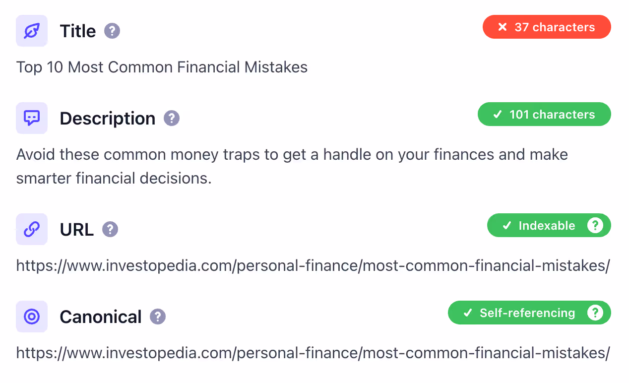
Now, there's one hurdle you'll need to overcome here—duplicate content.
- Google doesn't like to see the same article in two different places because it confuses search engines and makes it hard to choose the original version.
- This results in keyword cannibalization, where two or more of your pieces fight each other for the same keywords.
You can avoid this issue easily by using a canonical tag (rel="canonical")—a piece of HTML code that defines the original version of duplicate or similar pages.
When you set a canonical tag, you're telling Google which version to index and rank. This means there's no keyword cannibalization or diluted SEO performance among similar or duplicate pages.
When syndicating your content, only choose high-performing evergreen content. This ensures the article's long-term relevance and helps it accumulate backlinks over time.
Some examples of content you can syndicate include:
- General how-to guides
- Case studies
- Informative listicles
Before republishing, ask yourself if the piece will be relevant and accurate in five years. If the answer is "yes," you're good to go.
You can republish content on many platforms, such as LinkedIn and Medium. Medium is a particularly valuable syndication platform because authors often use it as a secondary channel next to their website's blog.
Medium even has publications dedicated to content syndication. A good example is Better Programming, which republishes developer tutorials from personal blogs.
9. Localize content with international SEO
If your offer extends to other countries and regions, you should identify 2–3 with particularly growing traffic or business potential. When you do, adapt your SEO strategy to them through effective content localization.
Your first step should be to translate all content to your markets' native languages. Doing so lets you draw in audiences who might not be bilingual, which can be a significant portion of your market depending on the exact location.
For best results, you'll want to go beyond word-for-word translations and adapt the content to each market's cultural context. This involves:
- Using language-specific phrasing and jargon
- Adapting your content to international audiences' pain points and preferences
- Tailoring the content to demographic factors (age, income, education, etc.)
After adapting your content, you'll need to perform a few technical tasks to help Google index and serve your pages for region-specific keywords. The most important tasks include:
- Choosing between country-specific subdomains (es.website.com), subdirectories (website.com/es), and top-level domains (TLDs) (website.es)
- Adding hreflang tags to specify that the same content is in different languages (this is especially important for countries with similar languages like the U.S. and Australia)
- Creating and submitting a sitemap to help search engines index your content
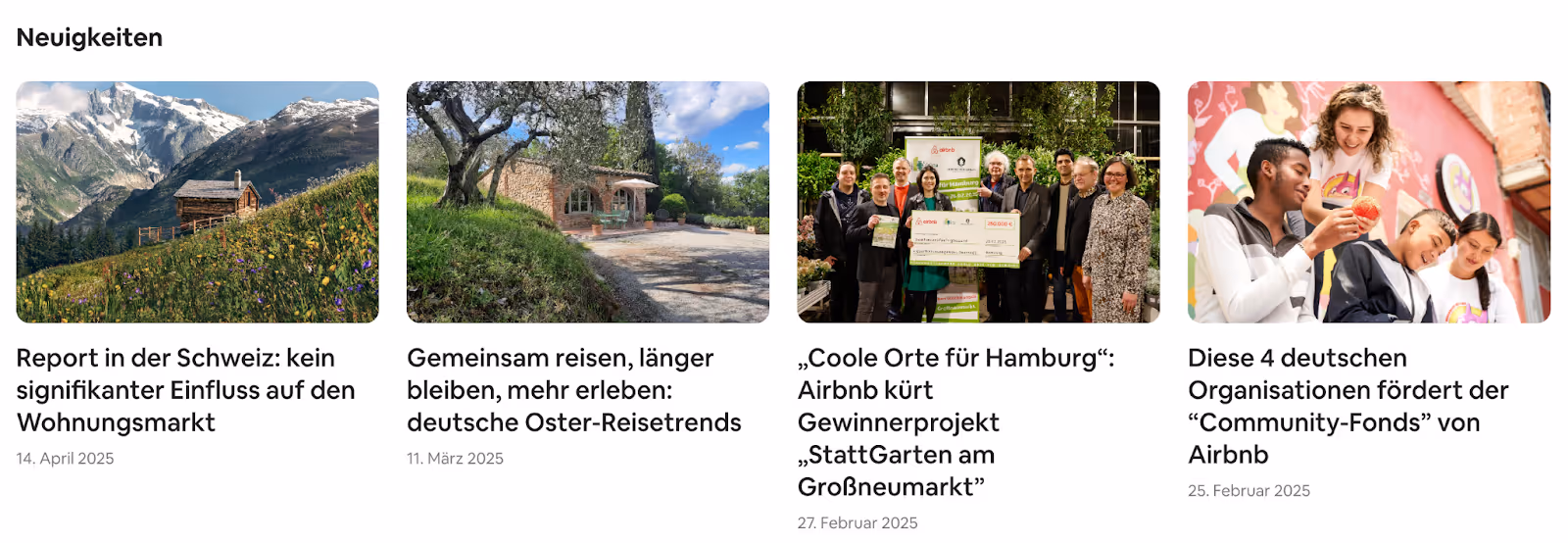
Companies in the travel industry often implement extensive international SEO to accommodate different audiences. Take Airbnb as an example—besides serving pages in over 60 languages, it adapts its structure and content to fit specific countries.
Airbnb Italy:

Airbnb Germany:
10. Create a hub for data or industry trends
Being the go-to source of reputable data is almost guaranteed to keep bringing qualified traffic and turning users into potential customers. To do so, you must go beyond data that a quick Google search can reveal and publish hard-to-find stats, timelines, or datasets relevant to your niche.
Place these resources in a centralized hub to consolidate their value and SEO performance. As your sources draw backlinks from citations and references, the entire hub will start ranking higher and attracting visitors.
To further strengthen the hub, link internally between related posts. If possible, use the clustering method I mentioned to demonstrate comprehensive topic coverage and position yourself as a credible source of all the data users need.
As your hub will contain data-driven content, you should have plenty of opportunities to integrate visual elements like:
- Charts
- Infographics
- Diagrams
You should also include citations and reference lists whenever you use second-party data to leverage the resources' credibility and demonstrate proof of the claims you make.
As for the hub's structure, ensure usability by highlighting the most valuable sources and including filters to help users find the exact sources they need.
Whichever way you go about it, make sure to update the hub regularly to ensure long-term relevance.
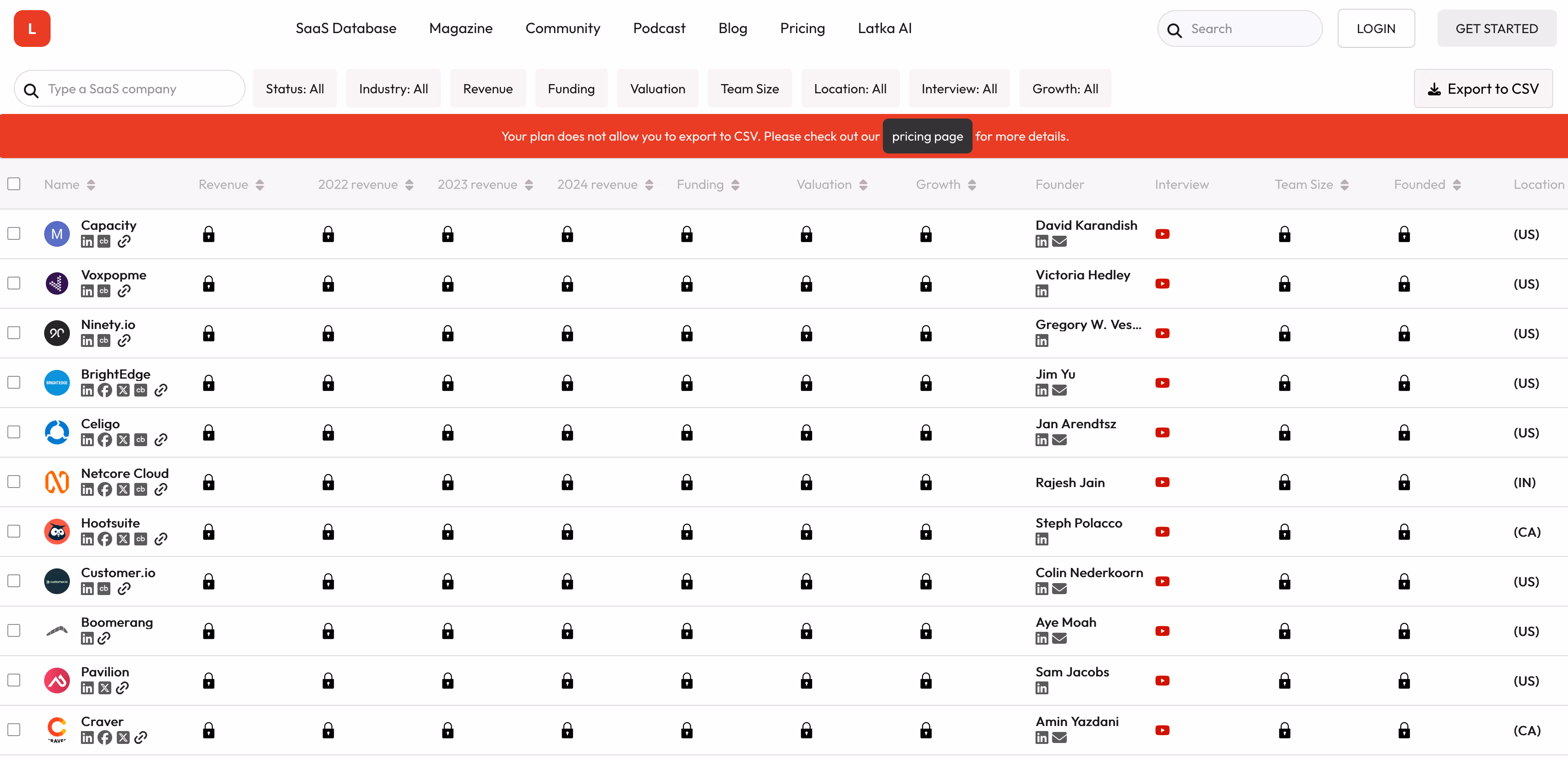
In many cases, you may not need to dig deep to find relevant and useful data—you can just make existing information easier to find. For example, Latka extracts SaaS company data from CEO interviews on their YouTube channel and creates a database with plenty of useful information (revenue, funding, team size, etc.).
Key takeaways
- You can promote your website without running Google ads or otherwise spending a lot of money—plenty of promotion strategies can be executed on a budget or without any costs.
- SEO is the most effective way to get free organic traffic and ensure long-term website growth. Perform comprehensive keyword research, use keywords strategically, and aim for topical authority by interlinking content into topic clusters.
- A strong personal brand helps build stronger relationships with your audience. Share unique insights and personal thoughts, and give users a behind-the-scenes look into your processes to boost engagement and nurture loyalty.
- Original research, free tools, and data-driven content are magnets for abundant traffic. Build useful tools related to your niche, and create a robust library of credible content that others can reference to help you build backlinks and increase traffic.
- You can expand your reach by tapping into the audiences of complementary businesses. Engage in partnerships through podcasts, interviews, giveaways, and similar collaborative efforts to attract fresh visitors.
- You should go beyond your website to draw in traffic from new channels. Use social media platforms, online directories, and forums to engage with your audiences throughout the web and encourage brand mentions.
- High-performing content can draw in traffic from different sources through content syndication. Republish content in reputable and frequently visited publications, but make sure to avoid duplication through canonical tags.
- If you serve audiences across countries, adapt your content to different markets by translating it and matching each country's cultural context. Use hreflang tags and country-specific URL structures to signal localization to search engines.