Surfer’s navigation has been completely redesigned to separate workspace management from organizational settings. With a new persistent top bar, breadcrumb navigation, and a brand-focused dashboard, users can now benchmark their performance against competitors and access their core tools faster than ever before.
As you scale from one domain to ten, your workflow can quickly become a "cluttered desk." We’ve redesigned the Surfer navigation and dashboard to give you a cleaner, more intuitive environment—one that separates your high-level business management from your daily AI SEO operations.
The goal? Less friction, more focus. We’ve rearranged the app to reflect exactly how you work, making it easier to switch between brands and dive straight into the actions that drive revenue.
How it works
A dashboard that greets you with context, not a blank slate
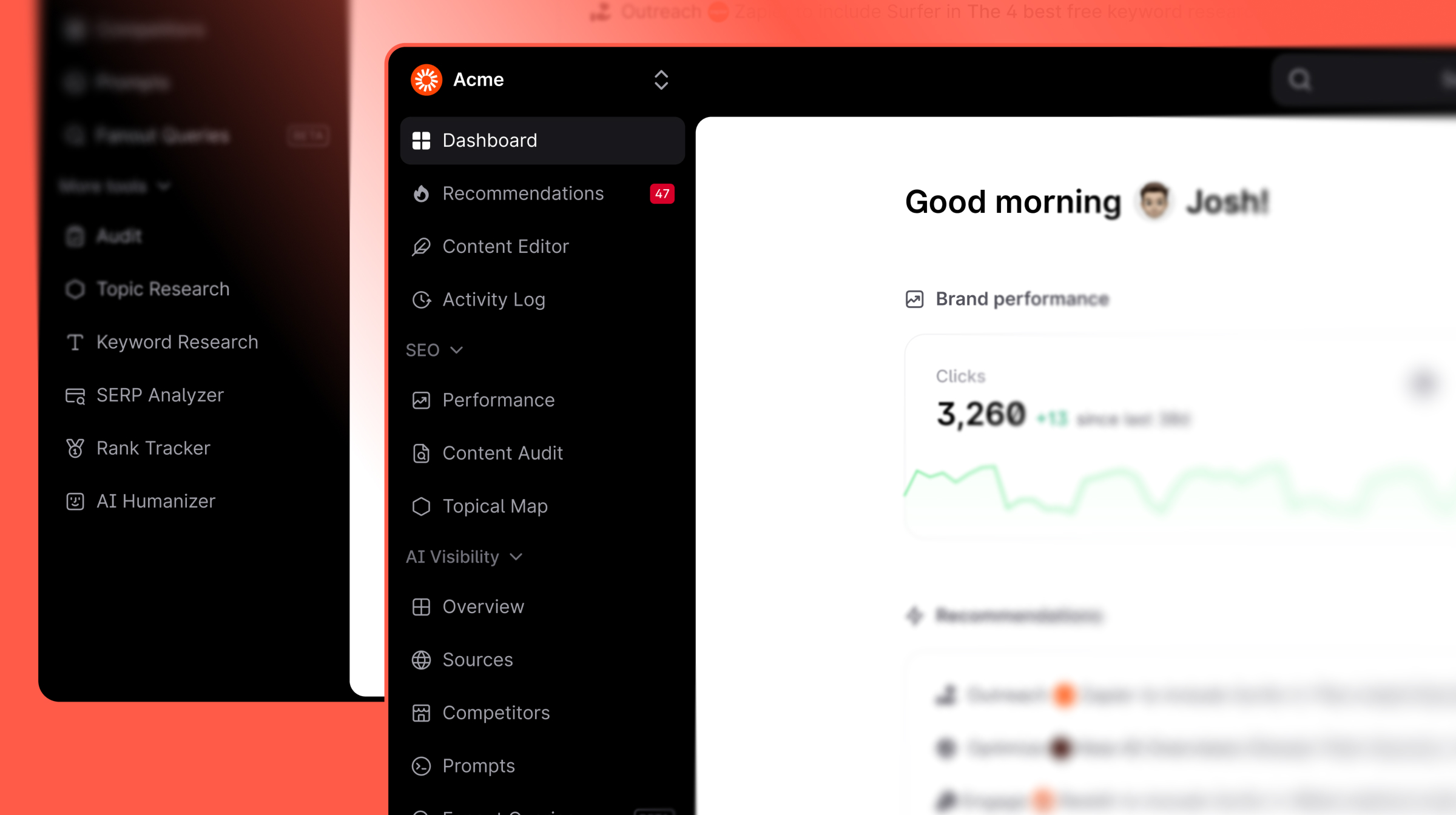
The new dashboard gives you a personalised starting point the moment you log in. You'll see:
- A personal greeting with your top performance stats — clicks, AI visibility score, and where you rank against competitors — right at the top, no scrolling required.
- Quick start actions (Create Content, Optimize Content, View Recommendations) so the most common next steps are always one click away.
- Brand performance charts for clicks and AI Visibility Score side by side, so SEO and AI health live in the same view.
- Recently edited articles so you can pick up exactly where you left off.
- Recommendations surfaced directly on the dashboard, so you always know which pages need attention.
- A Learn section with curated Surfer content — product updates, videos, webinars, and courses — so relevant education is always within reach.
For new workspaces, the dashboard shows a Get Started checklist (Audit your content, Check your AI Visibility, Write and optimize your content) to guide first-time setup without getting in the way of returning users.
Navigation that matches how Surfer is actually structured
- We’ve separated the Workspace Switcher (on the left) from the Organization/Session Switcher (on the right). This is a game-changer for agencies; your client-specific projects are now clearly siloed.
- Sectioned Navigation:
- Content — Content Editor, Performance, Content Audit, Topical Map, Activity Log
- Visibility — Overview, Sources, Competitors, Prompts, Fanout Queries
- More tools — Audit, Topic Research, Keyword Research, SERP Analyzer, Rank Tracker, AI Humanizer
- Persistent Top Bar with Search: The new top bar is always visible, featuring a centered Search bar (Shortcut: ⌘K). In the future, this will be your primary navigation hub—letting you jump to any tool or project instantly.
- Breadcrumb Navigation: We’ve replaced the old "Go Back" button with Two-Level Breadcrumbs. You’ll always know exactly where you are—whether you’re inside a specific Content Editor or reviewing a Brand Audit—and can navigate back to the main list in one click.
- Collapsible Sidebar for Deep Work: The Content Editor sidebar can now be fully collapsed, giving you a distraction-free writing environment. We’ve also moved secondary actions like Share, Version History, and Comments to the top bar to keep your workspace clean.
SEO tools and AI visibility tools no longer live in the same undifferentiated list. The sections collapse and expand, so you always see what matters for your current task without scrolling past everything else.
Why it matters
The best tools get out of your way. A dashboard that surfaces your performance and next steps immediately — and a sidebar that groups tools by what they do or hides away when you don’t need it — means less time orienting yourself and more time actually working.
This is a game-changer if:
- You manage multiple workspaces: Workspace switching is now faster and more visible, so context-switching between brands or clients takes seconds.
- You use both SEO and AI visibility tools: The new navigation makes it clear which tool does what — no more hunting for the right section.
- You value clutter-free workspace: The guidelines sidebar in Content Editor can now be hidden while you focus entirely on drafting.